
As I write this, we’re a bit over three weeks out from Baltimore Comic-con. A mix of excitement and anxiety is churning in my gut – excitement because, y’know, I’m hitting a big comic show for the first time in years (and, as noted in Part 1 of our harrowing journey [ahem, sorry, hyperbole switch was on], I am looking forward to meeting some of the creators whose work got me into comics and kept me reading for almost thirty years) and anxiety because: ahhhhh! I gotta get everything together for the show and can I do it in time? So, it’s an adrenaline-filled time leading up to Baltimore.
Luckily, much of what we need for the show Dan and I already have, thanks to the five-plus years we’ve been doing these shows.
· Banner – check (just have to remember it).
· Copies of Warrior27: the Collection – check.
· Individual issues of Warrior27 – check.
· Tablecloths – check.
· Business cards – I gotta look into this one, because I was without these at the CGS Super Show this spring.
· Freebies like pins and postcards – check.
· Copies of Indie Comics Horror #1 & New Orleans by Gaslight (with stories written by me included therein) – check.
· Older Mainelining chapbooks for sale (each one with a short comic story and short prose story written by me) – check.
· Comics written by Dan, including Fevre Dream and Warrior27: Push – check.
· Mainelining editions for editors and possible collaborators – volume 1 is all set, but I need to finish up volume 2.
· Change – we’ll get that a day before we leave
· Hand sanitizer – check.
· Markers/pens/other writing utensils – check.
· Stuff I’ve forgotten – not sure, that’s why it’ll be forgotten.
The first time Dan and I exhibited at a convention, we didn’t put much thought into it, or not as much as we probably should have. Our table at that first show was rather plain (read: dull). A few books. Some pins. A print for sale. And no artist. So, not much to catch the eye of passers-by. But we learned a lot from walking around the show and, especially, seeing what others in artists alley did with their tables. Upon returning home, I read some things online by other self-publishers exhibiting at comic conventions, while Dan did some more serious research into marketing and design. And we started to make a plan for the next convention.
One thing I noticed about some of the creators whose tables stood out was that they brought their own tablecloths – not necessarily finished tablecloths, but large swathes of fabric they used to pull together their display. We decided to go with red and black. Dan wanted to use that color scheme for the title on our second issues of Warrior27, and it seemed like a good color scheme. It’s a simple thing, but using the cloth makes our set-up look more professional, especially if you’re at a show where they have those paper tablecloths.
You also need to think about how you’re going to display your books. At our early conventions, the issue wasn’t how to fit it all onto the table as much as how do we make this look like a substantial amount of stuff? But with each year Dan and I have added to the collection of books we have on hand at any given show – which leads to other issues, but that’s not pertinent to our current thesis statement. We’ve been lucky at times to have a table on a corner and used a tall wire rack for our individual issues. This opens up the table a bit and offers a pretty nice display to catch people’s eyes. But, if you aren’t that lucky (or if the convention frowns on that because of traffic issues), then it’s a good idea to get a smaller stand to do the same thing on the table, or you could even use various sized boxes to create a series of steps for your books. Standing the comics and collections up, rather than laying them on the table, not only looks better, but it helps with people’s necks. From walking these conventions, I can tell you that bending your head down to look at what’s spread across the myriad tables can become physically taxing. So being afforded an opportunity to straighten up a bit can be a welcome change.

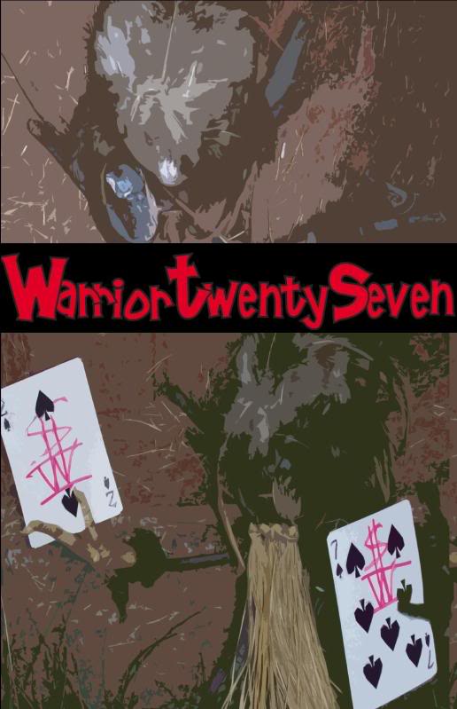
A banner was another thing I noticed at many exhibitors’ tables. Having a large image, whether art or text (as I’ve seen some creators, like Russell Lissau, do) can be helpful, but you need to be thoughtful about this because your banner will be the single most identifiable marketing image you have. You want it to be appealing while getting across what you’re selling, and there is a fine balance to achieve with this. I got some advice (for cover art, but it applied here as well) from an artist I know online, Marvin Mann, and he told me to go with a single, bold image. Dan and I chose the cover painting from our first issue, by Andy Lee , mainly because it is such a gorgeous image. I reached out to Marv again regarding colors for the text and borders of the banner, and he suggested I sample colors directly from the painting in order to make it “of a whole.” The final result is below.

Ultimately, you want to make your display as presentable as possible. Make sure the titles and prices are visible and easily read from a short distance away. Keep it neat. And, especially if you aren’t exhibiting with an artist, have a sample of the interiors readily available for browsing – whether you have an issue open in the middle of the display or possibly an oversized preview of a comic story or two (which I’ll have at Baltimore) – so that you break down the barriers as much as you can between you and the fan.
Next time: prepping the books.
You can read more from Chris at Warrior 27.
No comments:
Post a Comment